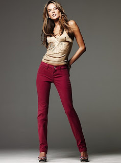
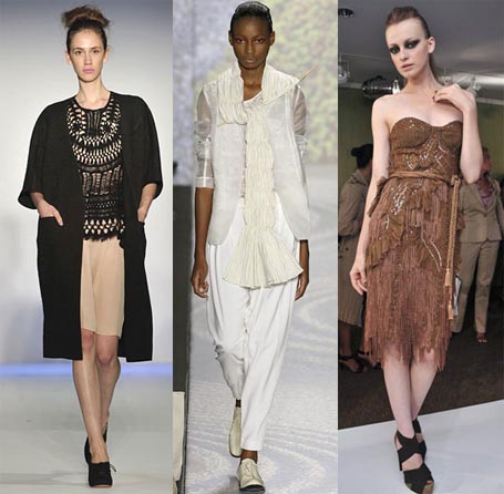
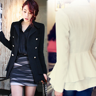
A collection should have 1 or 2 major silhouettes
Details should tie the collection together
Choose 3-5 colors for the color story and weave them throughout your collection.
Using Design in Fashion
THE ELEMENTS OF DESIGN are color, shape, line and texture.
THE PRINCIPLES OF DESIGN are balance, proportion, emphasis and rhythm.
The elements are put together in different ways to form designs.The principles are guidelines for using the elements.
Color
HUE: The name of the colorVALUE: How light or dark it is
INTENSITY or SATURATION: How bright or dull it is.
THE COLOR WHEEL
TERMS:
PrimarySecondary
Intermediate
COLOR SCHEMES:
NEUTRALS VS COLORSSome Rules for Color in Fashion
Light colors advance, Dark colors recede.
Bright or intense colors are best in small amounts
Black: Black often symbolizes power or control. It’s widely regarded as a formal color (e.g. black-tie affairs). In contexts, it can mean mourning or death (funerals), or submission (priests). For our purposes, black is a weighty color that signifies power and commands respect.
White: White represents light, purity, and innocence. It is notably clean and light in weight. Other connotations include simplicity and reverence. Very much considered a summer color (via the “rule” don’t wear white after Labor Day), though it can also be very formal (especially when paired with black) as in weddings, or from the fact that the most common shirt worn with a suit/tuxedo is white.
Red: Red is likely the heaviest of the hues. Its color is very bold to the eye, though not necessary displeasing. A range of meanings include love, anger, fire, power, respect and leadership. One of the most noticeable colors, even a small amount of red is easily noticed. Photographers are rumored to carry red soda cans with them to add a flash of red to pictures. Studies have shown that red actually has a physical effect, increasing heart rate and breathing rate.
Blue: Blue is one of the most popular colors, both in and out of the fashion world. Important meanings include calm, cool, cold, confident, and loyalty. The last of these is an oft-cited reason to wear blue to job interviews. Blue can, however, be interpreted as cold (in a sad/emotional way), so we should be careful to ensure that enough energy is present in the color to avoid this (if we wish to avoid it, that is).
Yellow: We often think of yellow as a happy color, associated with sunlight and optimism. However, its hue is the most “annoying” to our visual system. This may be the reason that yellow is actually the color which makes people angriest. In general, this effect can be tempered by reducing how striking the yellow appears by choosing lower values and saturations.
Green: Conversely, green is the easiest color for the eye to accept, likely due to the abundance of it in nature. This color is associated with growth, relaxation, fertility, and vigor. Of course, we also know it can symbolize jealousy, though I think this is more figurative than literal.
Purple: Often symbolizes royalty, ergo, wealth and success. Can also refer to delicacy in light shades (high value), or sensuality in darker shades with high saturation. Given its relatively infrequent appearance in the natural world, which accounts for its connection to wealth and rarity, purple can also seem unnatural or artificial.
Orange: One of the least used colors, orange is a tempered red in terms of intensity from a purely physical perspective, but its rare use also makes it easily noticeable. Similar ties as red; anger, desire, fire, danger, autumn, earth. People often connect “brown” most closely to orange.
Brown: Element of the earth, related to nature, stability, simplicity and tradition, and dependability. A very nonoffensive color, making it a common safe choice for fashion, especially with men.
Pink: Despite being technically red, pink, which is just red with very high value, is viewed very differently. Often represents femininity, softness, spring, flowers. Emotionally can represent love, admiration or gratitude. A very peaceful color, unlike the powerful and sometimes angry “red.”
Gray: Often viewed as a lack of color like black, when in reality it is just a lack of saturation. Commonly, gray will actually be a red or a blue with very low saturation. The difference is noticeable in some cases if you hold up the gray to some red or blue items. Depending on the underlying color, there are additional “readings” of the gray, but in general it represents wisdom, respect, neutrality, formality, or balance. Also interpreted as dull or boring." - From the fashionablemathmetician
SHAPE or SILHOUETTE
Wedge, tubular, bouffant, hourglass, A-line
LINE
Structural or Decorative
straight, curved jagged
TEXTURE
BALANCE
Proportion
Symmetrical (formal), Asymmetrical (informal)
EMPHASIS
RHYTHM
HARMONY
THE FASHION DESIGN SEGMENT:
Licensing
Design Timetable
Sources of Inspiration
WORLD FASHION CENTERS
United States
France
Italy
Great Britain
Canada
Central and South America
Japan
China and Hong Kong
Taiwan
South Korea
Names in Fashion Design
Homework: Pick one of the main Fashion Design Centers that we have talked about. Research 3 designers that work in that country. Do a presentation board or powerpoint with a brief profile of the designer and some examples of their work. Discuss what makes them representative of their country's fashion industry. No using the US!


No comments:
Post a Comment