Thursday, November 21, 2013
Monday, November 11, 2013
Principles of Design
Some Rules of thumb to remember:
A collection should have 1 or 2 major silhouettes
Details should tie the collection together
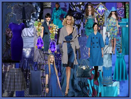
Choose 3-5 colors for the color story and weave them throughout your collection.
Using Design in Fashion
The principles are guidelines for using the elements.
VALUE: How light or dark it is
INTENSITY or SATURATION: How bright or dull it is.
Secondary
Intermediate
Some Rules for Color in Fashion
Light colors advance, Dark colors recede.
Bright or intense colors are best in small amounts
White: White represents light, purity, and innocence. It is notably clean and light in weight. Other connotations include simplicity and reverence. Very much considered a summer color (via the “rule” don’t wear white after Labor Day), though it can also be very formal (especially when paired with black) as in weddings, or from the fact that the most common shirt worn with a suit/tuxedo is white.
Red: Red is likely the heaviest of the hues. Its color is very bold to the eye, though not necessary displeasing. A range of meanings include love, anger, fire, power, respect and leadership. One of the most noticeable colors, even a small amount of red is easily noticed. Photographers are rumored to carry red soda cans with them to add a flash of red to pictures. Studies have shown that red actually has a physical effect, increasing heart rate and breathing rate.
Blue: Blue is one of the most popular colors, both in and out of the fashion world. Important meanings include calm, cool, cold, confident, and loyalty. The last of these is an oft-cited reason to wear blue to job interviews. Blue can, however, be interpreted as cold (in a sad/emotional way), so we should be careful to ensure that enough energy is present in the color to avoid this (if we wish to avoid it, that is).
Yellow: We often think of yellow as a happy color, associated with sunlight and optimism. However, its hue is the most “annoying” to our visual system. This may be the reason that yellow is actually the color which makes people angriest. In general, this effect can be tempered by reducing how striking the yellow appears by choosing lower values and saturations.
Green: Conversely, green is the easiest color for the eye to accept, likely due to the abundance of it in nature. This color is associated with growth, relaxation, fertility, and vigor. Of course, we also know it can symbolize jealousy, though I think this is more figurative than literal.
Purple: Often symbolizes royalty, ergo, wealth and success. Can also refer to delicacy in light shades (high value), or sensuality in darker shades with high saturation. Given its relatively infrequent appearance in the natural world, which accounts for its connection to wealth and rarity, purple can also seem unnatural or artificial.
Orange: One of the least used colors, orange is a tempered red in terms of intensity from a purely physical perspective, but its rare use also makes it easily noticeable. Similar ties as red; anger, desire, fire, danger, autumn, earth. People often connect “brown” most closely to orange.
Brown: Element of the earth, related to nature, stability, simplicity and tradition, and dependability. A very nonoffensive color, making it a common safe choice for fashion, especially with men.
Pink: Despite being technically red, pink, which is just red with very high value, is viewed very differently. Often represents femininity, softness, spring, flowers. Emotionally can represent love, admiration or gratitude. A very peaceful color, unlike the powerful and sometimes angry “red.”
Gray: Often viewed as a lack of color like black, when in reality it is just a lack of saturation. Commonly, gray will actually be a red or a blue with very low saturation. The difference is noticeable in some cases if you hold up the gray to some red or blue items. Depending on the underlying color, there are additional “readings” of the gray, but in general it represents wisdom, respect, neutrality, formality, or balance. Also interpreted as dull or boring." - From the fashionablemathmetician
A collection should have 1 or 2 major silhouettes
Details should tie the collection together
Choose 3-5 colors for the color story and weave them throughout your collection.
Using Design in Fashion
THE ELEMENTS OF DESIGN are color, shape, line and texture.
THE PRINCIPLES OF DESIGN are balance, proportion, emphasis and rhythm.
The elements are put together in different ways to form designs.The principles are guidelines for using the elements.
Color
HUE: The name of the colorVALUE: How light or dark it is
INTENSITY or SATURATION: How bright or dull it is.
THE COLOR WHEEL
TERMS:
PrimarySecondary
Intermediate
COLOR SCHEMES:
NEUTRALS VS COLORSSome Rules for Color in Fashion
Light colors advance, Dark colors recede.
Bright or intense colors are best in small amounts
Black: Black often symbolizes power or control. It’s widely regarded as a formal color (e.g. black-tie affairs). In contexts, it can mean mourning or death (funerals), or submission (priests). For our purposes, black is a weighty color that signifies power and commands respect.
White: White represents light, purity, and innocence. It is notably clean and light in weight. Other connotations include simplicity and reverence. Very much considered a summer color (via the “rule” don’t wear white after Labor Day), though it can also be very formal (especially when paired with black) as in weddings, or from the fact that the most common shirt worn with a suit/tuxedo is white.
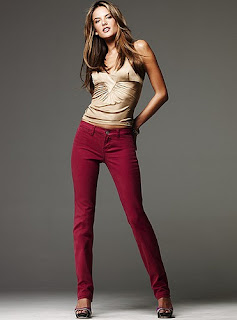
Red: Red is likely the heaviest of the hues. Its color is very bold to the eye, though not necessary displeasing. A range of meanings include love, anger, fire, power, respect and leadership. One of the most noticeable colors, even a small amount of red is easily noticed. Photographers are rumored to carry red soda cans with them to add a flash of red to pictures. Studies have shown that red actually has a physical effect, increasing heart rate and breathing rate.
Blue: Blue is one of the most popular colors, both in and out of the fashion world. Important meanings include calm, cool, cold, confident, and loyalty. The last of these is an oft-cited reason to wear blue to job interviews. Blue can, however, be interpreted as cold (in a sad/emotional way), so we should be careful to ensure that enough energy is present in the color to avoid this (if we wish to avoid it, that is).
Yellow: We often think of yellow as a happy color, associated with sunlight and optimism. However, its hue is the most “annoying” to our visual system. This may be the reason that yellow is actually the color which makes people angriest. In general, this effect can be tempered by reducing how striking the yellow appears by choosing lower values and saturations.
Green: Conversely, green is the easiest color for the eye to accept, likely due to the abundance of it in nature. This color is associated with growth, relaxation, fertility, and vigor. Of course, we also know it can symbolize jealousy, though I think this is more figurative than literal.
Purple: Often symbolizes royalty, ergo, wealth and success. Can also refer to delicacy in light shades (high value), or sensuality in darker shades with high saturation. Given its relatively infrequent appearance in the natural world, which accounts for its connection to wealth and rarity, purple can also seem unnatural or artificial.
Orange: One of the least used colors, orange is a tempered red in terms of intensity from a purely physical perspective, but its rare use also makes it easily noticeable. Similar ties as red; anger, desire, fire, danger, autumn, earth. People often connect “brown” most closely to orange.
Brown: Element of the earth, related to nature, stability, simplicity and tradition, and dependability. A very nonoffensive color, making it a common safe choice for fashion, especially with men.
Pink: Despite being technically red, pink, which is just red with very high value, is viewed very differently. Often represents femininity, softness, spring, flowers. Emotionally can represent love, admiration or gratitude. A very peaceful color, unlike the powerful and sometimes angry “red.”
Gray: Often viewed as a lack of color like black, when in reality it is just a lack of saturation. Commonly, gray will actually be a red or a blue with very low saturation. The difference is noticeable in some cases if you hold up the gray to some red or blue items. Depending on the underlying color, there are additional “readings” of the gray, but in general it represents wisdom, respect, neutrality, formality, or balance. Also interpreted as dull or boring." - From the fashionablemathmetician
SHAPE or SILHOUETTE
Wedge, tubular, bouffant, hourglass, A-line
LINE
Structural or Decorative
straight, curved jagged
TEXTURE
BALANCE
Proportion
Symmetrical (formal), Asymmetrical (informal)
EMPHASIS
RHYTHM
HARMONY
THE FASHION DESIGN SEGMENT:
Licensing
Design Timetable
Sources of Inspiration
WORLD FASHION CENTERS
United States
France
Italy
Great Britain
Canada
Central and South America
Japan
China and Hong Kong
Taiwan
South Korea
Names in Fashion Design
Homework: Pick one of the main Fashion Design Centers that we have talked about. Research 3 designers that work in that country. Do a presentation board or powerpoint with a brief profile of the designer and some examples of their work. Discuss what makes them representative of their country's fashion industry. No using the US!
Week of November 12-14th
TUESDAY NOVEMBER 12:
Speaker: Fashion Design student from China
DUE: QUIZ on Apparel Specifications - QUIZLET IS HERE
THURSDAY, NOVEMBER 14TH:
Speaker: Elissa Bloom from Fashion Incubator
DUE: Filled out marketing sheet
Speaker: Fashion Design student from China
DUE: QUIZ on Apparel Specifications - QUIZLET IS HERE
THURSDAY, NOVEMBER 14TH:
Speaker: Elissa Bloom from Fashion Incubator
DUE: Filled out marketing sheet
Saturday, November 2, 2013
Apparel - Women's, Men's and Children's
WOMEN'S WEAR
Product Classifications
Sportswear - separates
Knitwear - sweaters
Activewear - workout clothes
Coats/Suits - coats and business suits
Daytime Dresses - high end dresses
Evening Wear - formal wear
Intimate Apparel - underwear and sleepwear
Price Points
Couture - $10,000 for a jacket, $20,000+ for evening dresses
Designer - $750 - $1500 for a jacket, sold in high end stores and boutiques
Young Designer - $300-$800 for a jacket, specialty stores -Cynthia Rowley, Anna Sui
Bridge/Better - $400-$600 for a jacket, DKNY, Anne Klein II, Ellen Tracey
Contemporary - $150-$225 for a jacket, Liz Claiborne, Jones New York
Upper Moderate - $100-$120 for a jacket, Chaus, Evan Picone, JCrew
Moderate -$70-$150 for a jacket, Guess, Gap
Budget - Target, Kmart, Kohl's, Walmart
Private Label
Size Specialization
Misses - 2 to 14, even numbersJuniors - 0-13, odd numbers
Petites - 5'4" and under, odd numbers 1-13
Women's - 14-24, even numbers
Tall - 8-20
Maternity
Selling Seasons
Fall
HolidayResort
Spring
SummerMenswear
Product Classifications
Tailored clothing (Bespoke) - suits
Friday wear - casual yet work appropriate
Men's Furnishings - ties, socks, etc
Casual Wear -shorts, casual shirts
Active Sportswear - athletic clothing
Outerwear - coats
Work Clothes - coveralls
Rainwear - raincoats
Size Specialization
Tailored Clothing
•Regular
•Long
•Short
•Extra Long
•Portly/Stout/Big and Tall
Children's wear
Size Specializations
InfantsToddlers
Children's
Girls
Boys
Preteen
Tuesday, October 29, 2013
More Careers in Fashion!
Promotions and Other Fashion Related Careers
Communicating Fashion
Modeling
• Runway Models• Fit Models
• Photographic Models
Fashion Photography
• Photographers Assistant• Photo Stylists
Fashion Writing
• Fashion Journalists• Fashion Reporter
• Copywriters
• Editors
Fashion Illustration
Audio Visual Work
Web Site Design
Visual Merchandising
Display Managers
Display Designers
Fashion Advertising
Advertising Directors
Account Executive
Media Buyers
Art Director
Graphic Designers
Layout Artists
Public Relations
Entrepreneurship and Other Fashion Related Careers
Entrepreneurial Opportunities
Home Based Business
Independent Sales Representative
Owning a Retail Shop
Dressmaking or Tailoring
Apparel Production
Trading Company
Freelancing and Consulting
Theatrical Costuming
Textile Preservation
Costume Curators
Educators
Here is a site that will help with basic resume structure:http://www.law.harvard.edu/current/careers/opia/toolkit/resumes/resume-layout.html
And this gives some tips to people fresh out of college:
http://www.forbes.com/sites/susanadams/2012/05/10/how-to-write-a-resume-when-youre-just-out-of-college/2/
HOMEWORK: Due Thursday, October 31 - 4 designs for your mood board collection. They should be completed and colored but do not have to be on a board.
Due Tuesday, November 6th, Bring a copy of your resume, and your designs mounted on your board.
Thursday, October 24, 2013
Careers in Fashion
Careers in the Fashion Industry
Overview of the Industry
Fashion offers some of the most exciting, challenging and fascinating careers. It also demands hard work and dedication. Few positions offer a 9-5 workday.The seasonality of the industry can result in hectic periods followed by relatively slow times.
Employees tend to change companies frequently, but this is also a way to climb the career ladder.
Career Planning
Entry LevelManagement
Selecting a Career Path
Strive toward needed training
Gaining Experience
Textile and Apparel Careers
A Career in the Textile Industry
Research and Development
Textile Design
Fabric Designers
•print/repeat artist• colorists
Grapher
Converter
Dyer
Production Manager
Textile Sales Rep
Fashion Design
Designer
Design assistant
Merchandiser
Stylist
Patternmakers
Pattern Graders
Markers
Spreaders
Cutters
Assorters
Sewers
Finishers
Inspectors/trimmers
Pressers
Product Managers
Quality Contril
Manufacturers Sales Rep
Retailing
General Merchandise Manager
Divisional Merchandise Manager
Buyer
Assistant Buyer
Product Developer
Store Manager
Regional Manager
Department Manager
Fashion Director
Advertising Manager
Visual Merchandiser
HOMEWORK: Bring in 4 designs, finished and in color. They do not have to be mounted on a board yet. Due Tuesday, October 29
READING: Chapter 7 - Careers in Fashion. There will be a quiz!
Saturday, October 5, 2013
Thursday, October 9th - Midterm Review
Due Today: Quiz on vocab - Fashion and Acceptance
Quizlet is HERE
MidTerm Review
Fashion, The History
• Rose Bertin, Charles Worth• Industrial Revolution - inventions
• Fashion now - challenges and opportunities
The Powerful Consumer
• Demographics• Psychographics
• Family Life Cycle
• Income Level
Multicultural Consumers
• Market Segments• Growth Potential
Fashion and Acceptance
• Fashion Vocabulary• Fashion Cycles
• Fashion Leaders - Essay Question
Quizlet Vocabulary Terms are HERE
Midterm Exam will be on Tuesday, October 14
Mood Board is due on Thursday, October 16
Tuesday, October 7 - Creating a Mood Board
How to create a mood board
Mood Boards - Fall 2013
Examples
It should cover the entire board. (No larger than 11x14) There should be no, or very little empty unused space.
Mood Boards - Fall 2013
Examples
Examples of Mood Boards
Homework: Final Board Due Thursday October 24th
HOMEWORK: Create a Mood Board for a store or designer of your choosing. This should NOT consist just of pictures of their clothing. It should include other images - photographs, color swatches, images from nature, etc - that express their Brand Image.It should cover the entire board. (No larger than 11x14) There should be no, or very little empty unused space.
Sunday, September 29, 2013
Fashion and Acceptance - October 1
Language of the Trade
QUIZLET!!
Adaptation
Classic
Collection/Line
Couturier
Dress Down Fridays
Fad
Fashion
Haute Couture
Knock-off
Pret a Porter
Sample Sales
Seventh Avenue
Silhouette
Style
Taste
Fashion Cycles
"Being able to predict fashion movement is vital to success in both the buying and selling of fashion products." - Mary Wolfe
Understanding
fashion movements and predicting trends is a vital skill to anyone
working in the fashion industry. Buyers must be able to make
knowledgeable decisions based upon this understanding.
Question to consider: What are some elements that cause fashion to change?
Terms:
Theories of Movement:
Trickle up
Trickle down
Trickle across
introduction;rise;peak;decline;obsolescence
Length of run:
variations
Factors can speed or slow movement
Principles of Fashion Movement
- Consumer acceptance or rejection establishes fashions
- Price does not determine fashion acceptance
- Fashion Movement is evolutionary, not revolutionary
- Fashion reaches extremes then reverses direction
FASHION LEADERS
Entertainment
First Families
Royalty
Sports Figures
Youth Movements
PANTONE COLOR FORECASTING
Wednesday, September 25, 2013
Thursday, September 26th
DUE TODAY: Homework: Check out the above websites. With the information you gain, create a line of three outfits that target the needs and shopping habits of a multicultural consumer
College and Studying
How much should a college student study? |

|
First it's important to remember that by being in college
you are investing in your future.
Most sources recommend that a typical undergraduate college student should study at least 2 hours outside of class each week per unit credit. So for a 4 credit hour course, this common guideline suggests that a typical student should spend at least 8 hours outside of class studying for that course each week. Certainly this general guideline depends on the student and on the course. But if you aren't doing well in a course, then ask yourself, "How much time do I spend studying compared to this general guideline?" CliffsNotes.com has a short but well written article on this topic. (Read more...)Some students respond with, "That's impossible!" Actually it's very possible and still leaves a lot of time to spare. Let's suppose a typical student has a 20 credit hour load and spends 23 hrs/wk in class (20 in class plus, let's say 3 additional lab hours). Following the above guideline, a typical student should spend about 42 hrs/wk studying outside of class. (Labs do not generally require 2 hours of outside study time per hour spent in the lab.) So far that's a total of about 65 hrs/wk devoted to academics. Since a week has 168 hrs, that leaves 103 hrs per week. If we allow for 7 hrs of sleep/day (49 hrs/wk), that leaves 54 hours each week for other things! For more ideas on how to use your time wisely, read this. We’re coming up on back-to-school time, and for thousands of young people everywhere, that means taking their first great big step into adult life: college. Going to school, whether you stay at home or travel across the country or around the world, can be terrifying. It can also be your life’s greatest adventure. What you do in your first year of college can have a big impact on the rest of your college years – not to mention on the rest of your life. A few missteps might be possible to undo later on, but too many wrong moves and you might well find it impossible to recover later. Blow off too many classes, for example, and your grades will suffer – and no matter how much you reform your ways in ensuing years, your GPA will always suffer. Do poorly enough, and you might find yourself on academic probation or even thrown out come the end of the school year! It doesn’t have to be that way. And your first year doesn’t have to be an endless drudge, either. What’s important right now is not that you bury yourself in schoolwork until you bleed, sweat, and crap knowledge, but to establish a healthy balance of academic work, social activity, and just plain living – a balance that once established, you’ll find easy to maintain through the rest of college and into your future. Here, then, are my 15 tips for making the most of your freshman year:
|
Saturday, September 21, 2013
Tuesday, September 24 - Presentation Boards
Please bring your art supplies to class on Tuesday. We will be working in class on our boards.
Presentation boards are used on fashion design and merchandising to present and express ideas. They should be clear, attractive and professional.
Fashion presentation resources:
Fashion Presentation boards: standards and guidelines
General recommendations for Fashion Presentation boards.- Captions
- keep your fashion boards informative. It must be clear what your board represents. Fashion trend related and /or seasonal information information should be on a presentation board.
- readable font: readability first !!!Font size: big enough to be read easily but not too big.
- technical perfection: Check quality of your technical drawings (flats) ,textile designs, fashion illustrations and photos before you compile your board.
- Layout
- Always preserve some space as a visual frame for your fashion board
- Use the space of the board efficiently without wasted space .
- Economize the space on the fashion board by overlapping your
technical drawings (flats) and other visuals ( for example textile
swatches)


negative space around the Fashion Presentation boards, "visual frame", overlapping of visuals (technical drawings, fashion illustrations and textile swatches) helps to create very focused and efficient fashion presentation boards ( by Dominique Acevedo) - Use either perfect symmetry or absolute asymmetry as a principle of layout for Fashion Presentation boards .


Symmerical board Assymmerical board - All elements in your Fashion Presentation must be aligned


perfectly aligned boards by Robin Thompson look very organized and very focused - Composition of the page must include all design basics requirements, and first of all, Balance and Unity
- implementation
- Background: curb your enthusiasm. Keep it simple, no pictures on the background unless it is a necessity
- minimum embellishments . Focus on the layout not on decoration.
- Limit yourself in color: keep a minimum of colors on your board
- Keep your colors in harmony : if you
have to use more than one/two colors for your board, arrange your colors
in harmony. Analogous color scheme or monochromatic color scheme
usually are perfect solutions for coloring boards without taking too
much attention from content.
- Outline swatch including it in a visual box frame.
- Use 3D effects .
- Make color of background more de-saturated and more neutral than the colors of your designs. Consider a different value for color of a background ( lighter or darker) than your images on a board.
- Style :
- contrast of proportions (big and small ) Include close-ups as a reinforcement to general image.


"close ups" with accent on important details help designer to focus attention on the most important aspects of the presentation designs and fashion presentation boards by Slavica Trifunoska : see Slavica Trifunoska portfolio - Originality of imagery : If your image is not created by you it must be either copyright free, or you have to obtain a written permission from the copyright owner allowing you to use the image. It is unprofessional and in some cases illegal to use other people's creations without their permission.
- contrast of proportions (big and small ) Include close-ups as a reinforcement to general image.
Remember, that you are not selling your boards, you are selling the collections of garment or fabric with the help of your boards , therefore , visual and written data must be the logical focus of your presentation. . This is not Fine Art where you are expressing yourself for the sake of Art, this is Design, therefore think of function of your presentation first. Follow the logic of data-driven, content-oriented board and make the content of your board the paramount. Do not disrupt viewer's attention from content of your board by over-decorating your board.
- http://www.behance.net/gallery/Presentation-BOARDS/6892741
Subscribe to:
Comments (Atom)


